What Can We Tell Using Maps?
A Map's Possibilities As An Infographic Design
City & Life no.85 autumn 2007
Feature : Map and Town ---- See, Walk and Draw
THE DAI-ICHI HOUSING RESEARCH&ADVANCEMENT FOUNDATION.
Interviewer : Makoto Sato(ARCHIVE CO., LTD.)
A map is actually no more than a visual language for communication, just like any other information graphic, or infographic, which organizes and presents information through visual languages such as diagrams and charts.
For precisely this reason, we can say a map still has latent potential, states Hiroyuki Kimura, a leading expert of Japanese Infographics.
For twenty years, as head of TUBE GRAPHICS Kimura has created infographics including maps, the core of his work, diagrams, charts, graphs, and pictograms.
How can we make a map more interesting and understandable? If we show something in the form of diagram, it helps us understand it even if we don't speak the language. He has tried to bring out the potential of maps by re-positioning them in the category of infographic design.
" I have loved maps since my childhood. My father, a sailor of whaling ships, often wrote me letters from his ports of call. I was really curious to know which country's stamps and postmarks on the letters were from. So, I began looking up maps; that's how my association with them got started.
From the first I loved small expeditions. I spent my spare time going to local mountain streams, or exploring caves on the coast, finding stalactites deep inside them. I always had maps with me. I never forgot my maps even when going to neighboring towns.
Being such a map geek, I studied geomorphology at university, hoping to get a job at the Geographical Survey Institute. And it was then that I encountered this book."
So saying, he held out a book entitled Map, the Adventure of Images (Kawade Shobo Shinsha, 1978). The book had an impact even on me, however, it had stronger influence on Kimura; it shaped the course of his later life.
"I opened the book almost every day. Then I heard that one of the authors, Nobuo Morishita, was going to publish a book New Technique Series : Making Maps (Bijutsu Shuppan Publishing,1979). I waited for it with high expectation, and the moment I found the book at the bookstore, I had no doubt that this was the only course I could pursue. I called on Morishita at once. I knocked on his door at the weekend, and by Monday, I was already working there."
Kimura came to produce "Pia Map" at Morishita's office. At that time, Pia was not the weekly magazine that it is today. Once a month, a two-page map appeared on the center spread of the magazine.
At that time they had to discover a new way of creating maps through their own efforts. Today with Google maps, we could make it easily. However, at that time they had to go the location, walk round every alley and build it up piece by piece. It took a lot of effort.
"We couldn't draw every roadside tree, so I used the method I discovered when sketching in the park at high school; making several color patterns and combining them gave a realistic look.
In about the third year of working with Morishita, I encountered another decisive book for my career. It was Atlas of Europe (Bartholomew/Warne, 1974) , designed by Rufus Segar. This may have had an even stronger impact on me.
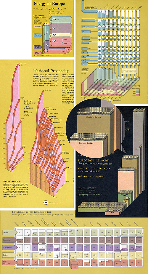
The book compares European countries using not only maps, but also graphs and charts. 3D diagrams of bar charts, line graphs and tables were combined together, sometimes with pictograms. The multiple expressions, viewpoints and designs were totally innovative and fresh.
Looking at the book, I thought "Now I get it". Using such ideas, maps could be made more understandable, accessible, quite different from before. I had been wondering if I could make more interesting maps, so "That's what I was looking for!", I thought.
At that time, Bollmann's New York map was famous as a 3D map. The map draws the buildings in Manhattan soaring high into the air. Little by little, similar maps had been introduced to Japan. However, Kimura says that Segar's 3D map is fundamentally different from Bollmann's.
"Bollmann's map simply gives a 3D view of Skyscrapers in New York, just looking down obliquely from the sky. However, Rufus's diagrams, so to speak, have a 360-degree field of vision. The difference is, information is expressed in the image."
Bollmann's 3D map is trying to display the city almost exactly with axonometric perspective. Therefore, for example, we can not see the other side of the buildings since the angle is determined.
But because Segar's diagrams have a kind of deformation, they freely focus on what he wants to show. For this reason, if he wants to show the rear of the building, he can. Even buildings seen from below can exist within Segar's designs.
"It becomes possible because it's an infographic map. I mean, the style of the map is determined by the aim of the map. The mind-set it totally different from the traditional maps. It was astonishing for me, and changed my perspective.
Let's say, I'm going to make a guide map. A guide map is used when someone goes somewhere new. If someone gets lost while using the map, it cannot be called a "guide" map. A guide map looks effortless to make, but it's kind of an Archetypal map, crystallising the need to cover information.
What should I show in the map? And how? From the visitor's point of view? Or perhaps a view from the desitination might be better? We can choose to look from directly overhead, or from the side. We should always design a map from the perspective of the person needing it.
By classifying maps with other infographics, I want to emphasize that the point is what we see in them, the meaning they convey. I see many more things we can do with maps. And with more people going online every day, the possibilities get even wider."
The use and provision of maps is shifting rapidly from print to online, and the very approach that distinguishes between text and graphics is now called into question. Under such circumstances, infographics are becoming increasingly important. That is to say, the time of Kimura's maps has finally come.
|
|
|
|
|
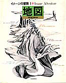
Map, the Adventure of Images
(Kawade Shobo Shinsha, 1978)
|
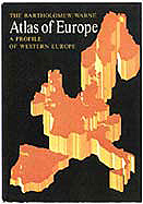
Atlas of Europe
(BARTHOLOMEW / WARNE, UK, 1974)
|
|
|
|
Atlas of Europe (BARTHOLOMEW / WARNE, UK, 1974)
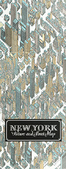
New York (Bollmann-Bildkarten-Verlag, 1962)
|
|